Your Brand in 2027: When to Refresh Your Logo, Colors and Website
The signs your logo, colors or website have fallen behind, the ones that don’t justify touching anything, the three levels of change and the order to roll it out without customers losing track of you.
Short answer
Refresh your brand when your logo can’t be read on a phone, when every place you show up has a different version or when the business has changed and the look still describes the old one. Being tired of looking at it is almost never a good enough reason. Often a tune-up does the job, not a new brand.
The end of the year is when a lot of owners look at their logo and decide it’s dated. Sometimes they’re right, and sometimes the one who’s tired of it is the owner, not the customer. Before you pay for a new logo, it’s worth telling those two apart, because a new look has a cost that never shows up on the designer’s invoice: the customer who knew you by your color or your sign has to learn to recognize you all over again.
The study behind the first number dates to 2002 and measured opinions, not purchases. Still, what it found plays out every day: people size up how you look before they read what you do.
Signs it’s time for a refresh
1. Your logo falls apart at small sizes
Try this: look at your logo as an Instagram profile picture, in the little WhatsApp circle and in a browser tab. If it has thin lettering, a tagline baked in or five colors, it turns into a smudge at those sizes. Plenty of logos were designed for a storefront sign or a business card, back before first impressions happened on a five-inch screen.
2. Every place shows a different version
Check your Google Business Profile, website, social accounts, truck, invoices and uniforms. If you find three logos, two shades of blue and your name spelled a couple of different ways, that’s an organization problem more than a design one. Google and AI tools also pay attention to whether your name, address and phone match everywhere. We cover that in your Google Business Profile in 2027.
3. The business changed and the brand didn’t
You started with one service and now offer four. You opened a second location. You work with companies now, not just families, or with English-speaking customers on top of Spanish-speaking ones. If your name or logo says something that isn’t true anymore, like a single specialty or a neighborhood you moved out of, your brand is working against you.
4. Your website looks like it’s from another decade
The website is the part of a brand that ages fastest. If people have to pinch and zoom on their phone, if the photos are obvious stock or if the design doesn’t match what customers see when they walk in, they notice before they read a single line.

When to leave it alone
- When the only reason is that you’re sick of it. Your customers see it far less often than you do.
- When people in your area know you by a color or a symbol. That took years to build. Protect it.
- When the real problem is something else: too few customers because of slow follow-up, stale reviews or a slow website. A new logo won’t fix any of that.
- When you can’t afford to change it everywhere. A half-finished rebrand, with the old logo on the van and the new one on the site, is more confusing than the old brand.
Ready to apply this to your business?
Tune-up, refresh or rebrand
Most people think it’s all or nothing: keep it as is or change everything. In practice there are three levels, and most established businesses need the first or the second.
| Level | What changes | When it makes sense | Risk |
|---|---|---|---|
| Tune-up | Clean up the logo, lock in a color palette and a typeface, build a small version for social | The brand works but looks messy or doesn’t read on a phone | Low: customers still recognize you |
| Refresh | Logo redrawn around the same idea, adjusted colors, new website, real photos | The business grew or changed, but the name still fits | Medium: you have to announce it and switch everywhere at once |
| Rebrand | Name, logo, colors and everything else | Mergers, a name that conflicts with another brand or no longer describes what you do | High: you lose some recognition and have to rebuild it |
Colors and two languages
If you change colors, keep it tight: one main color, one accent and a neutral usually cover it. Test them on white, on a dark background and over a photo, and make sure text still reads on a phone in full sun, which in Miami is a real-world test. If you serve customers in English and Spanish, think about how the name sounds in both languages and whether the tagline works in each without a forced translation. We get into that in bilingual branding without losing your identity.
Before you launch: make sure nobody else has it
If you’re changing your name or logo, first check whether someone in your industry already uses something similar. The USPTO has a public trademark search along with guides for checking similar marks, including logos by design codes (USPTO Trademark Search). To register a mark or sort out a conflict, talk to a trademark attorney.

The rollout order that keeps your customers
- List every place your brand shows up: Google profile, website, social, directories, email, invoices, vehicles, signs, uniforms and stationery.
- Switch the digital pieces on the same day: Google profile, website and social. That’s what people and AI tools see most.
- Keep your name, address and phone identical everywhere, unless that’s exactly what’s changing.
- Tell your customers with an email and a simple post: what changed and why, no big production.
- Leave physical items like signs and vehicles for last, but set a date so the old brand isn’t floating around for another year.
If you’ve already made the call and want ideas for the launch, here are five tips for rolling out a rebrand.
Where to start
- Today: set your logo as a profile picture on your phone and see if you can still read it.
- This week: gather everything with your brand on it, physically or in screenshots, and count how many versions you find.
- By the end of January: decide whether you need a tune-up, a refresh or nothing at all, and write down what would change and where.
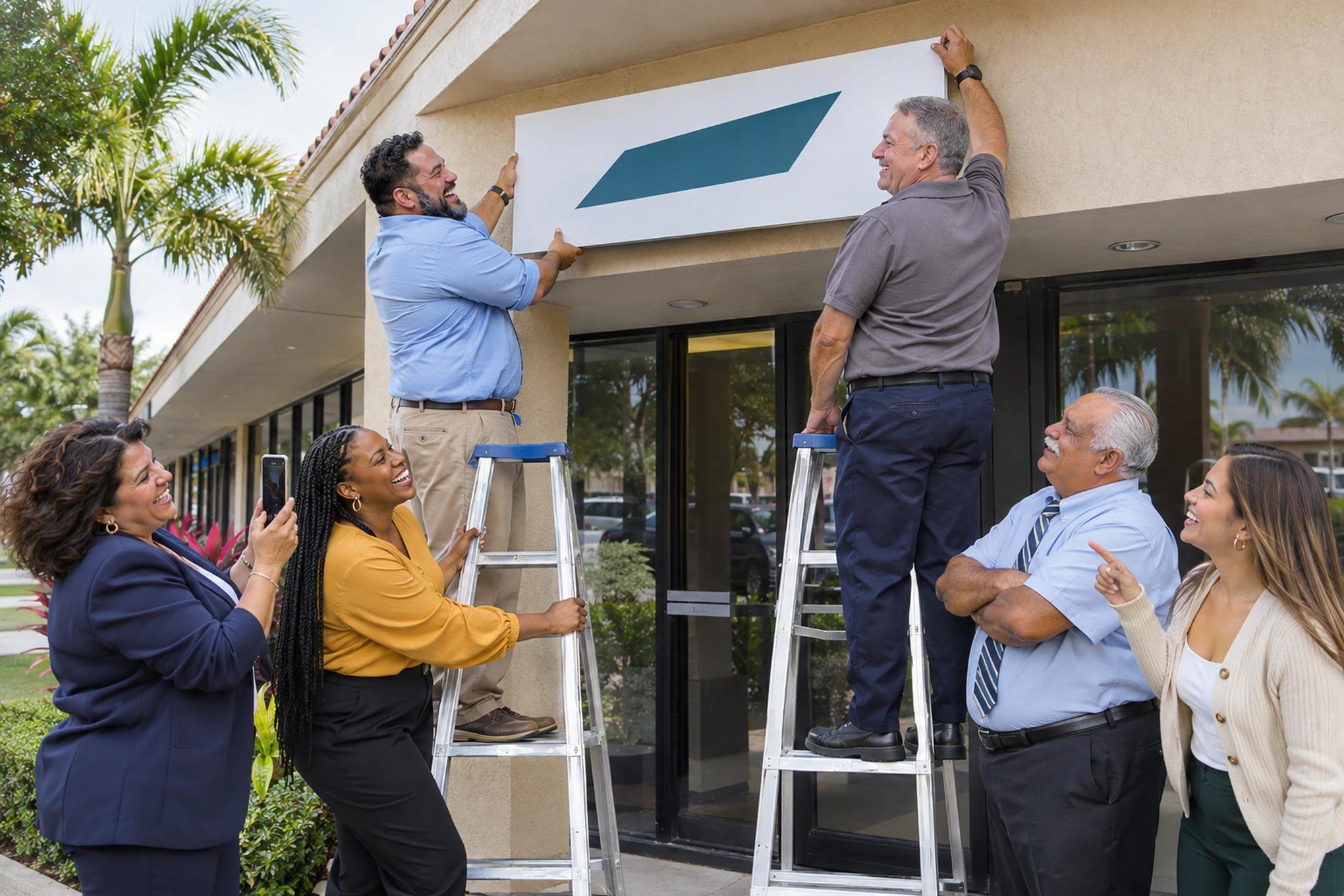
A good brand refresh has a lot of moving parts that need to change together: logo, colors, website, photos, social and stationery. That’s how we handle it at Brito, tied into the rest of your marketing and in English and Spanish. In our branding portfolio you can see logos, stationery, color palettes, branding on vehicles, billboards and apparel, and QR signs for collecting reviews. If you’d like to see what makes sense for your business in 2027, you can build your plan in 2 minutes whenever you have a moment.
Frequently asked questions
How often should a business change its logo?
There’s no set number. Some brands have kept the same symbol for decades, with an occasional touch-up. Change it when one of the reasons above applies, not because a certain number of years went by.
Can I make my logo with AI?
For exploring ideas, sure. For the final logo, be careful: it can end up looking like one that already exists, and legal protection for AI-generated work isn’t clear-cut. Have a designer review it and run a trademark search before you use it.
Will changing my logo hurt my Google ranking?
The logo itself, no. What can hurt is changing your name, address, phone or website URLs without redirecting them. If you touch any of those, do it carefully and everywhere at once.
Should I change the brand and the website at the same time?
For a refresh, usually yes. The website is where your brand shows most, and doing both together keeps you from paying twice. If it’s just a logo tune-up, the site can wait its turn.
Twenty years building brands in New York, Las Vegas and Miami, where he's based today. He leads a Miami team that shoots commercials on cinema cameras and runs proprietary AI infrastructure. He believes great marketing starts with truly understanding the customer — and that honesty, often frowned upon in this industry, is what separates partners from vendors.
View profile→Questions about your business?
The first conversation is an assessment, not a sales pitch. Let's talk.
Or explore our AI Advertising service
2,745 Dental Practices Compete in Miami-Dade and Broward: Why Would a Patient Choose Yours?
We measured the dental market in Miami-Dade and Broward with federal and state data: how many practices compete, which ZIP codes they cluster in and how patients choose today. There's no shortage of options, only of clear reasons to pick one.

Florida Lawyer Advertising Rules: What The Florida Bar Requires and How to Comply
What The Florida Bar's Rule 4-7 requires in a law firm's ads: name and city, language, testimonials, "expert" claims, actors, and filing with the Bar 20 days ahead. Every rule, with its number and source.