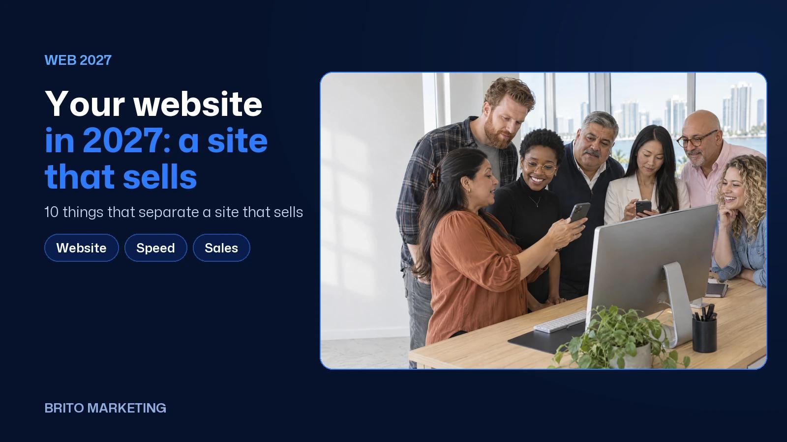
Your Website in 2027: 10 Things That Separate a Site That Sells From One That Just Sits There
A site that sells says what you do in seconds, works on a phone, keeps the next step in sight and answers what customers ask. The 10 differences, with real examples and 2025–2026 data.
Short answer
A website that sells gets ten things right: it says what you do and where in five seconds, it's built for phones, every screen has a clear next step, each service has its own page, the photos show your team, proof is easy to find, both languages are real, it loads fast, it answers common questions and it tracks results.
Almost every business has a website. Very few have one that pulls its weight. The difference isn't how good it looks. It's what happens when someone opens it in a hurry from the parking lot, right after reading your reviews or getting your name from an AI tool. If your site gets traffic but not calls, start with the five signs your website is costing you customers. This post goes a step further: what to have in place for 2027, one item at a time.
1. It says what you do, who it's for and where, in five seconds
The first screen has one job: letting people know they're in the right place. “Excellence in comprehensive solutions” tells nobody anything. “Pool resurfacing in Orlando and Central Florida” does. Read your headline out loud and ask whether a stranger would know what you sell, who it's for and where you work without scrolling an inch.
2. It's built for phones, not squeezed onto them
Pew Research Center reports that 91% of U.S. adults own a smartphone, and 23% of Hispanic adults have a smartphone but no home broadband (Pew Research Center, 2026). For a lot of your customers, the phone is the only screen they've got. That means buttons sized for a thumb, a phone number that dials with one tap, short forms and text you can read without pinching to zoom. When a site was designed for a big monitor and shrunk down later, people can tell.

3. Every screen has a clear next step
A site that just sits there tucks a contact form at the very bottom. A site that sells repeats the main action wherever someone might be ready: up top, after each service and in the footer. Stick to one primary action (book, request a quote or call) and at most one backup, like WhatsApp. On the D&J Pool Resurfacers site, for example, the free quote button shows up in the header, in the hero and again further down, and the phone number dials with a single tap.
4. Each service gets its own page
A single “Services” page with a bulleted list doesn't help customers or Google. Every service that matters deserves its own page: what it is, who it's for, how long it usually takes, what happens at the first visit and the questions people ask on the phone. That way, someone searching for something specific lands right on it. The Art Dental Studio site in Miami splits its work into cosmetic, general, orthodontics and restorative, and each one links to its own page.
5. Photos of your people and your work
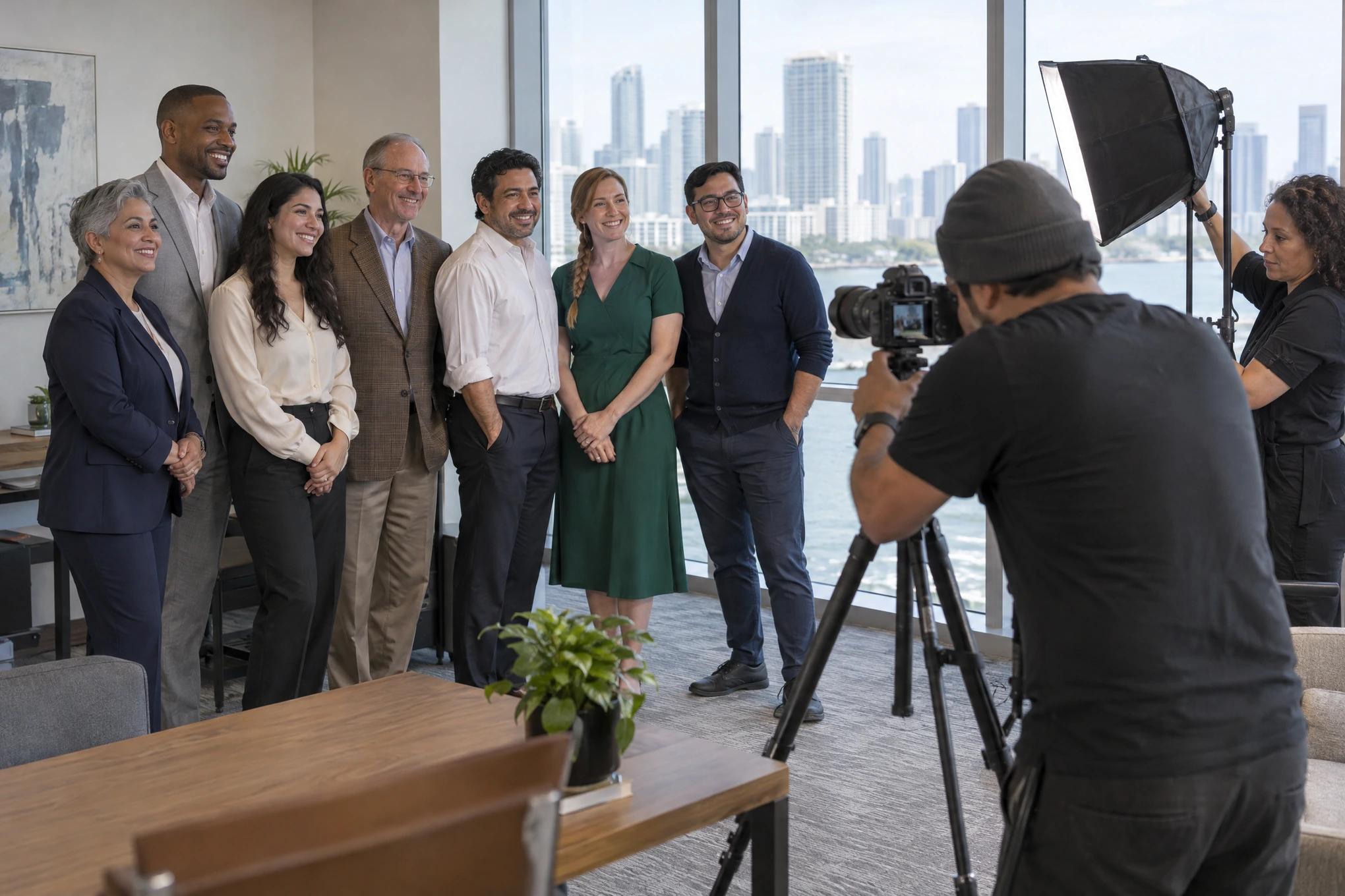
Stock photos are easy to spot, and they don't tell a customer who they'll be dealing with. The photos that sell show your team with names and roles, the inside of your space and finished jobs. If you're in healthcare, be careful with results photos, since Florida has specific rules for them. And no matter the industry, never show work you don't actually do.
6. Proof that's easy to find
That 54% is why your website can't contradict your reviews. The visitor already read that you're good and came to double-check. Put the convincing stuff in plain sight: real reviews with names, licenses, years in business, awards anyone can verify, finished projects. And make sure your address and hours match your Google Business Profile, because a mismatch plants doubt right when they were about to call.
Ready to apply this to your business?
7. Real English and real Spanish, not a translate button
In South Florida, a one-language website shuts out half the city. But auto-translate might be worse: people notice, and it tells them you didn't bother. What works is a full version in each language, written by someone who actually talks that way, with its own menu, its own forms and its own confirmation messages. Art Dental Studio runs its Spanish site at its own address, and the D&J site lets visitors switch between English and Spanish right from the header.
8. It loads fast on an ordinary phone
In the HTTP Archive's July 2025 analysis, only 48% of websites passed all three of Google's Core Web Vitals on mobile (HTTP Archive, 2025). In other words, more than half fall short somewhere. For a plain-English breakdown of what each one measures, read what Core Web Vitals are and how much they really matter. The practical rule: test your site on your own phone, on cellular data, the way a customer would.
9. It answers questions before people have to call
Do you take my insurance? How long does it take? Are you open Saturdays? Do you come out to my area? If those answers aren't on your site, people call to ask, or more likely they go with someone whose site does answer. They're also exactly the questions people type into ChatGPT or Gemini, and those tools read your website to answer them. Write each answer in two or three clear sentences on the matching service page. To dig deeper, see our step-by-step guide to getting named by AI.
10. It tracks what happens after the click
A site that just sits there gets judged on visits. A site that sells gets judged on what it produces: calls, form fills, booked appointments, WhatsApp messages. Every one of those should land in one place, tagged with the date and the page it came from, so you know which services and pages bring in real customers. Without that, a redesign is a shot in the dark.

| Item | A site that just sits there | A site that sells |
|---|---|---|
| First screen | A vague slogan and a stock photo | What you do, who it's for and where |
| Phone | Desktop layout shrunk down | Built for thumbs, with one-tap calling |
| Next step | Form at the bottom | One main action, repeated where it's needed |
| Services | A list on one page | A page per service, with its own FAQs |
| Photos | Stock images | Your team, your space, your work |
| Proof | No reviews or licenses in sight | Named reviews, licenses and real projects |
| Languages | Auto-translate button | Full English and Spanish versions |
| Speed | Never been tested | Tested on a phone over cellular data |
| Questions | Answered only over the phone | Answered on the site in a few sentences |
| Tracking | Visits | Calls, forms, bookings and messages |
Where to start
- Today: open your site on your phone over cellular data and time how long it takes to find what you do, where you work and how to reach you.
- This week: list the ten questions you get most on the phone and check off the ones your website already answers.
- This month: pick your most profitable service and give it its own page, with real photos, its common questions and one clear button.
If you want to see these ideas on live sites, our web design portfolio has the ones we've built for dentists, law firms, a restaurant and a pool company. Rebuilding a website while running a business is a lot, which is why at Brito we build it connected to everything else: video we shoot ourselves, BritoCRM catching every inquiry, and search on Google and in AI tools, in English and in Spanish. We've worked out of Miami since 2006. In Miami-Dade and Broward we come to your business; farther out, we meet by video call. If you'd like to know which of these ten your site is missing, request a free assessment and we'll walk through it with you, no strings attached.
Frequently asked questions
Do I need to rebuild my whole website for 2027?
Not always. Plenty of sites improve a lot with targeted fixes: a clear headline, the main button repeated, a page per service and answers to common questions. A rebuild makes sense when the site breaks on phones or the platform won't let you make those changes.
Can't a Facebook or Instagram page replace a website?
It helps, but it's no substitute. You don't own those platforms, they won't let you lay out your services your way, and Google and AI tools read your website to understand what you do. BrightLocal also found that more than half of people go to the website after reading reviews.
Is a bilingual site worth it if almost all my customers speak one language?
In South Florida, it almost always is, because the person who decides or pays isn't always the one who calls. What matters is that the second version is complete and well written. An auto-translated site does more harm than not having one.
How do I know if my website is actually selling?
Count the inquiries it produces each month (calls, forms, bookings and messages) and which page each one came from. If you can't count them, that's the first fix, before any design change.
Twenty years building brands in New York, Las Vegas and Miami, where he's based today. He leads a Miami team that shoots commercials on cinema cameras and runs proprietary AI infrastructure. He believes great marketing starts with truly understanding the customer — and that honesty, often frowned upon in this industry, is what separates partners from vendors.
View profile→Questions about your business?
The first conversation is an assessment, not a sales pitch. Let's talk.
Or explore our AI Advertising service
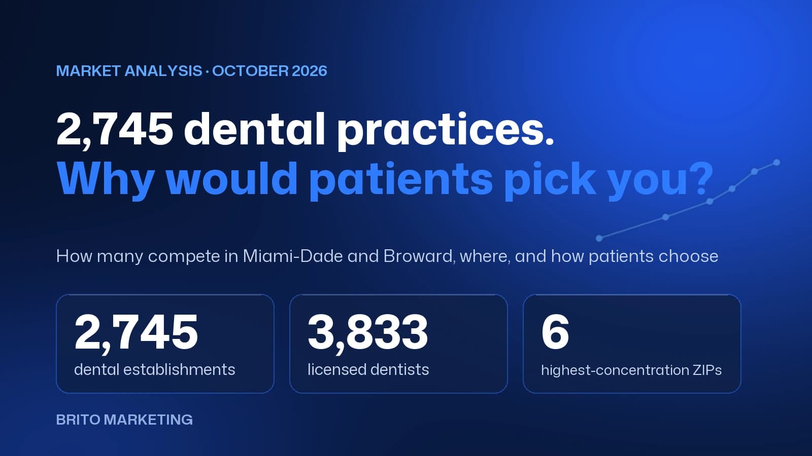
2,745 Dental Practices Compete in Miami-Dade and Broward: Why Would a Patient Choose Yours?
We measured the dental market in Miami-Dade and Broward with federal and state data: how many practices compete, which ZIP codes they cluster in and how patients choose today. There's no shortage of options, only of clear reasons to pick one.
Florida Lawyer Advertising Rules: What The Florida Bar Requires and How to Comply
What The Florida Bar's Rule 4-7 requires in a law firm's ads: name and city, language, testimonials, "expert" claims, actors, and filing with the Bar 20 days ahead. Every rule, with its number and source.